KIA Access App Redesign & AI Integration
Business team wants to propose an app refresh to KIA’s current Connected Vehicle App. This proposal includes enhancement to user experience as well as AI integration.
Role
UX Designer, Idea Generation, UX Research, Brand Application
Scope
2 Weeks, Dec 2024
For in-depth details of my work, please contact me.
Opportunity
Kia is looking to change its visual identity and also improve user open rate for KIA Access app.


Goal
Provide a new redesign proposal that focuses on usability and simplicity to encourage users to open the app more frequently and spend more time on the home page.
Let’s begin
Due to the rapid turnaround rate, we got right into the final design stage. We compare existing connected vehicle product designs as well as applications that incorporate AI into their design. By doing this, we can take the what works from each product and plug it into our design. In addition, it also cuts out a lot of the drafting stage which was not afforded in this project.


Draft 1
Features > AI


Draft 1
AI > Features


Draft 3
Priority Features > AI > Lesser Features
Feedback
While AI Assistant is a feature to be suggested, it did not need the spotlight. Priority was shifted to remote functions and features, while seamlessly incorporating AI. Also
Final Design
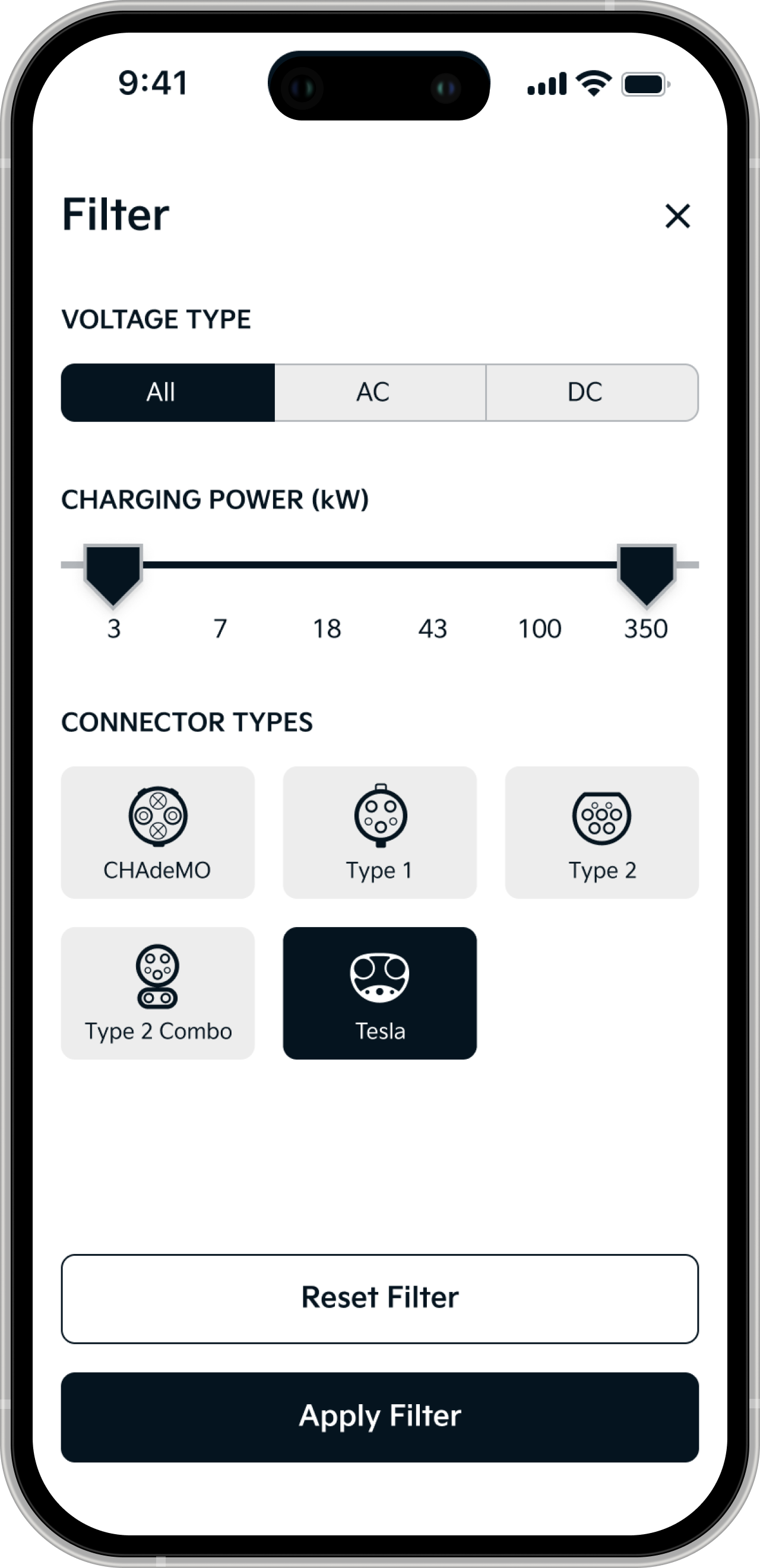
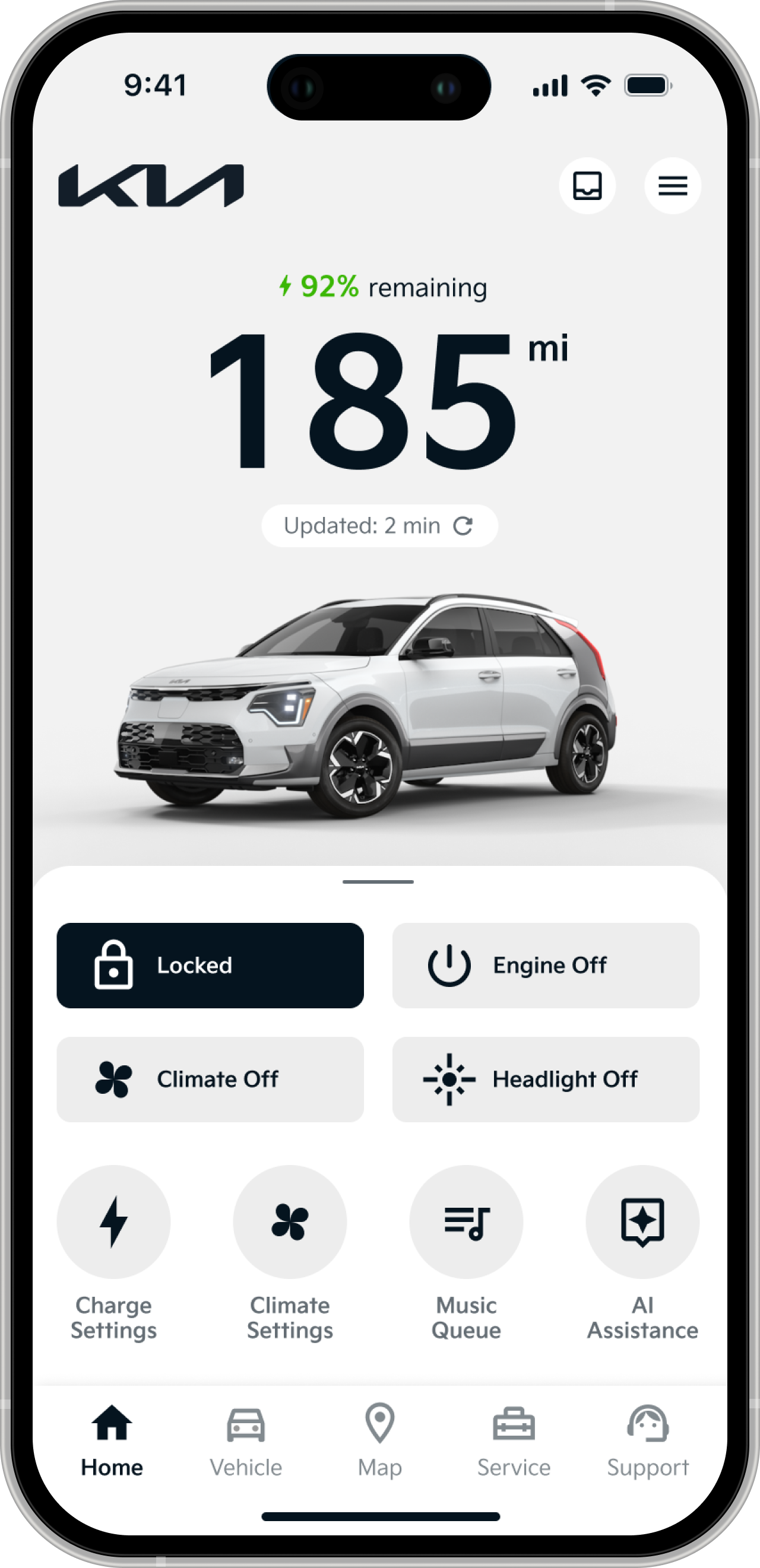
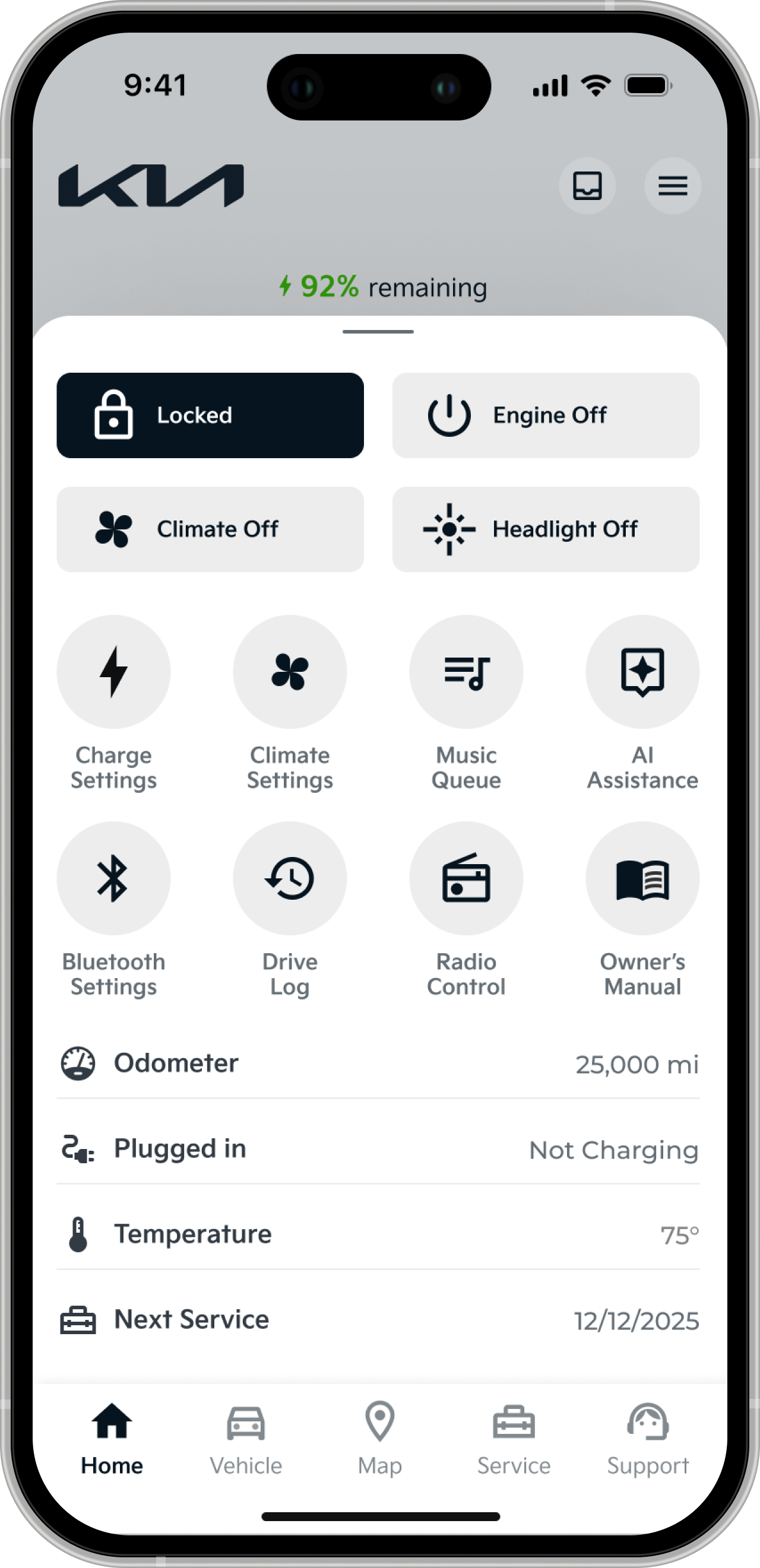
The biggest issue with the existing KIA app was that it was busy. Although there was a lot of pathways and tools available on the home screen, users would be overwhelmed by the amount of information. Especially, because it was not displayed in a clearer fashion.
In our solution we wanted to establish some clear hierarchy between the available content and functions. The most relevant information, the amount of charge and miles the vehicle has remaining, is available at the top. It takes up a good amount of the screen as it is the most important piece of information for the user. It pairs well with the image of the car, which helps to break up the monotonous screen and further call the user’s attention.
Below that are some common functions and pathways that the user would access for a connected vehicle app. This sits on tab that can be expanded by swiping up, revealing more information that is not necessary on every view.
Lastly, the AI screen is a simple chat screen with suggested actions and a heavily emphasized input area.

Old
New
Deliverables